Traversing the Archive Visual Identity UX/UI Design
Consulate General of Sweden, Istanbul
Year
January 2023
Services
Visual Identity
UX/UI Design
UX/UI Design
Project
Traversing The Archive UX/UI Design
Traversing The Archive Websitesi Tasarımı UX/UI
Traversing The Archive Websitesi Tasarımı UX/UI
Website
As StudioTA, we had the pleasure of working closely with an exceptional team of collaborators during the designing of the website Traversing the Archive. This project was made possible through a fruitful partnership with esteemed individuals, including Aslı Yurdanur, Cultural Affairs Coordinator at the Consulate General of Sweden in Istanbul, and Mike Bode, a Swedish visual artist, researcher, and organizer who also serves as the Counsellor of Culture Affairs at the Consulate General of Sweden, Istanbul.
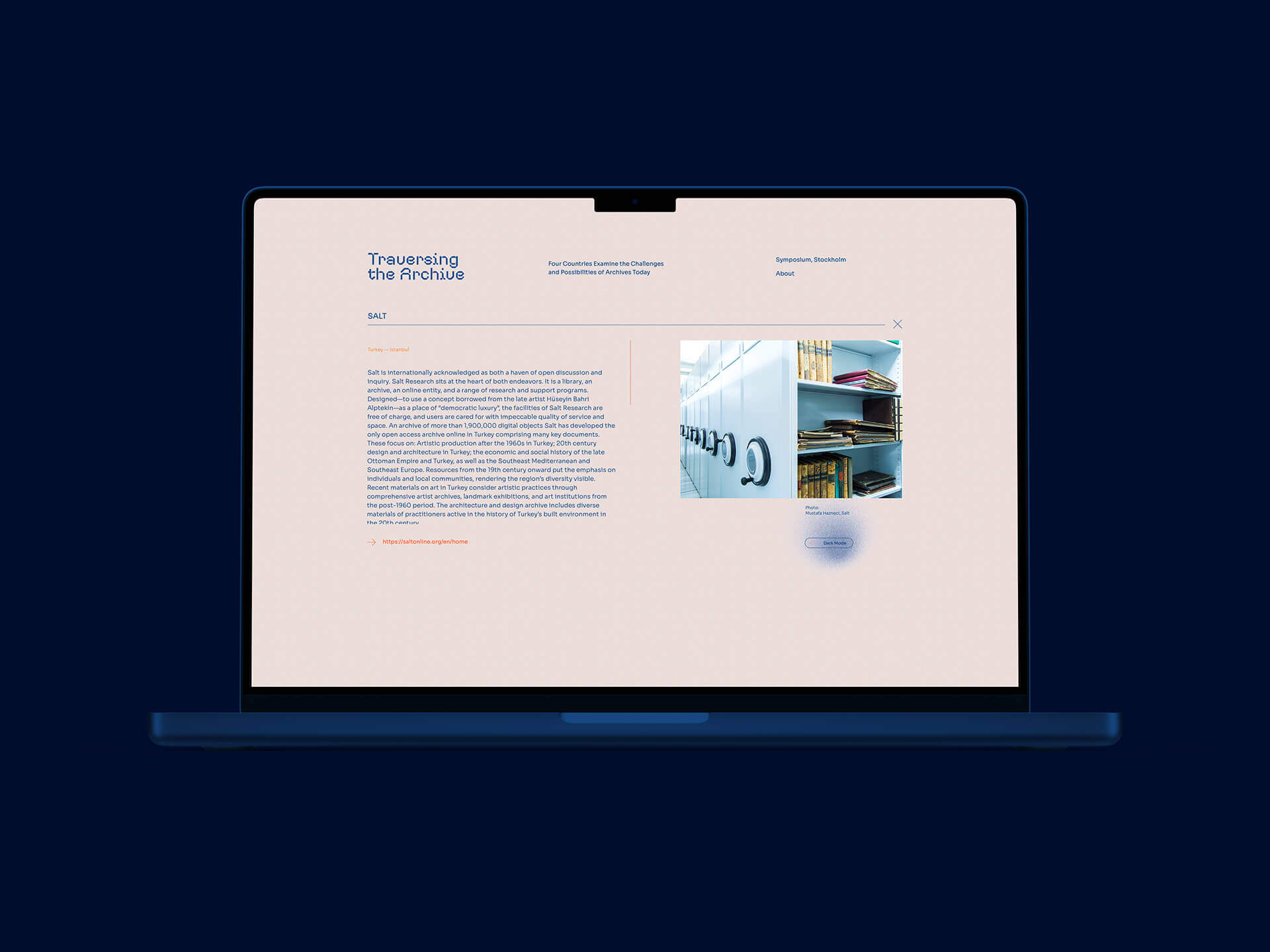
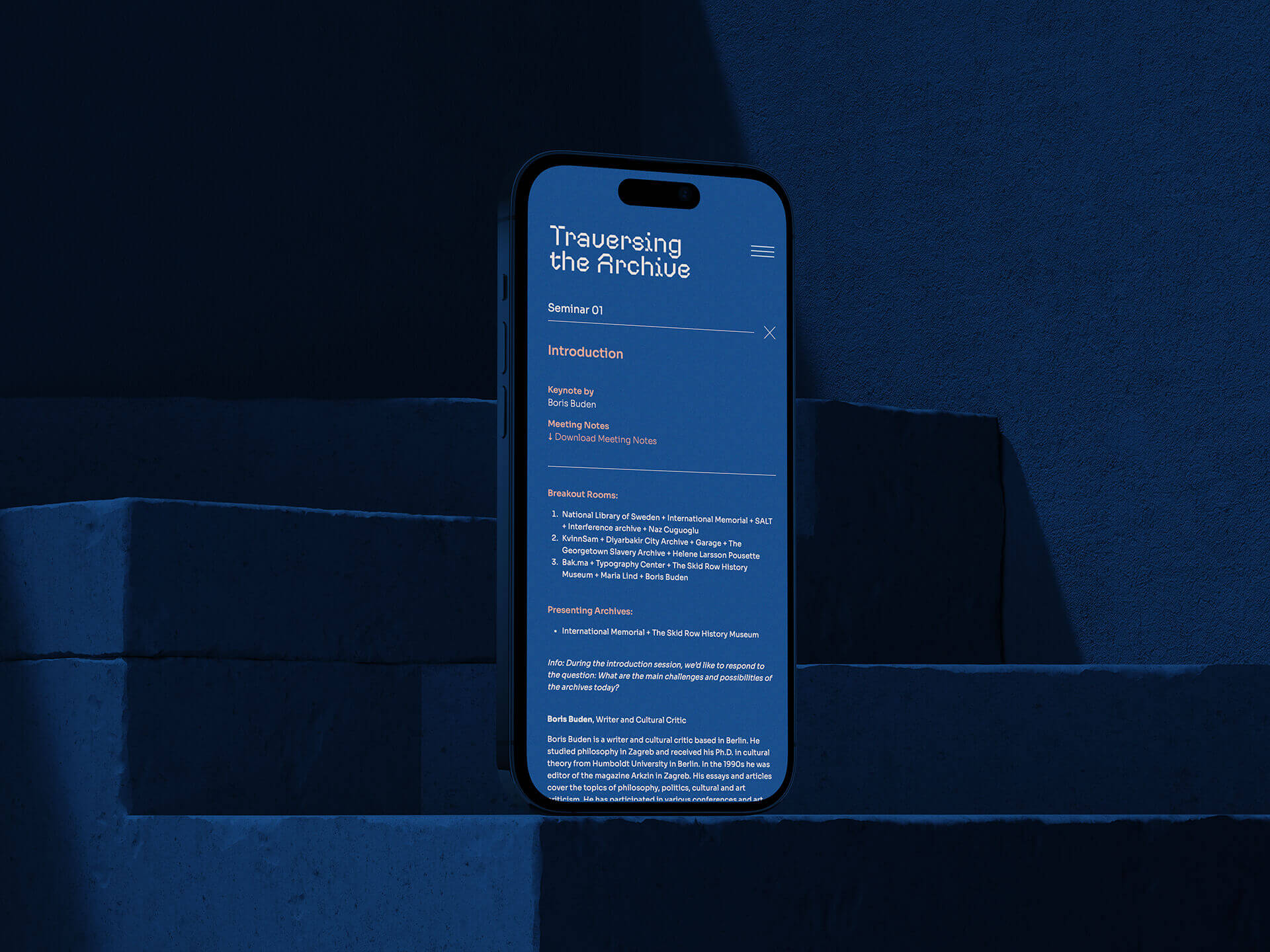
The website is a digital platform that serves as an extension of a broader project focusing on the challenges and possibilities of archives in the modern world. Through a series of digital workshops and seminars, this project brings together archives from diverse geographies: Türkiye, Russia, the USA, and Sweden.
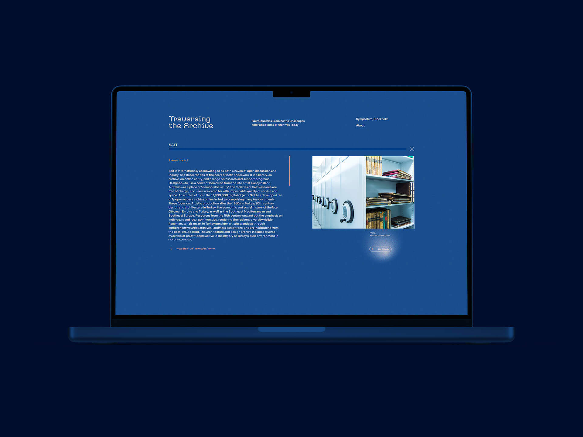
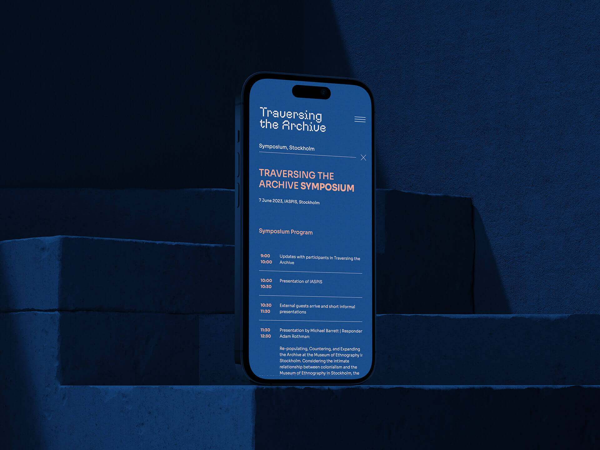
Our primary responsibility was the UX and UI design of the website. This involved crafting the user’s journey through the site, ensuring that it was intuitive and visually appealing. Our collaborative efforts extended to working closely with the Consulate General of Sweden in Istanbul to align the design with the project’s goals and vision.
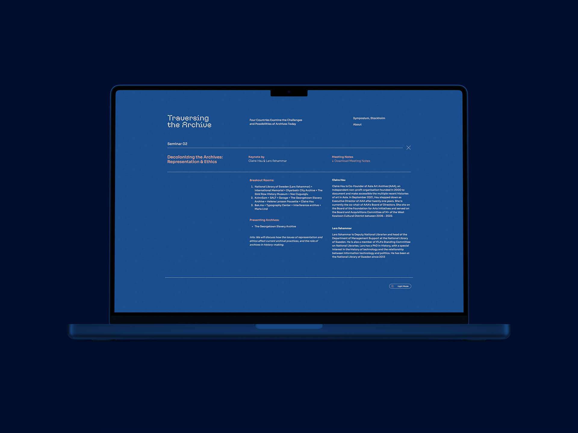
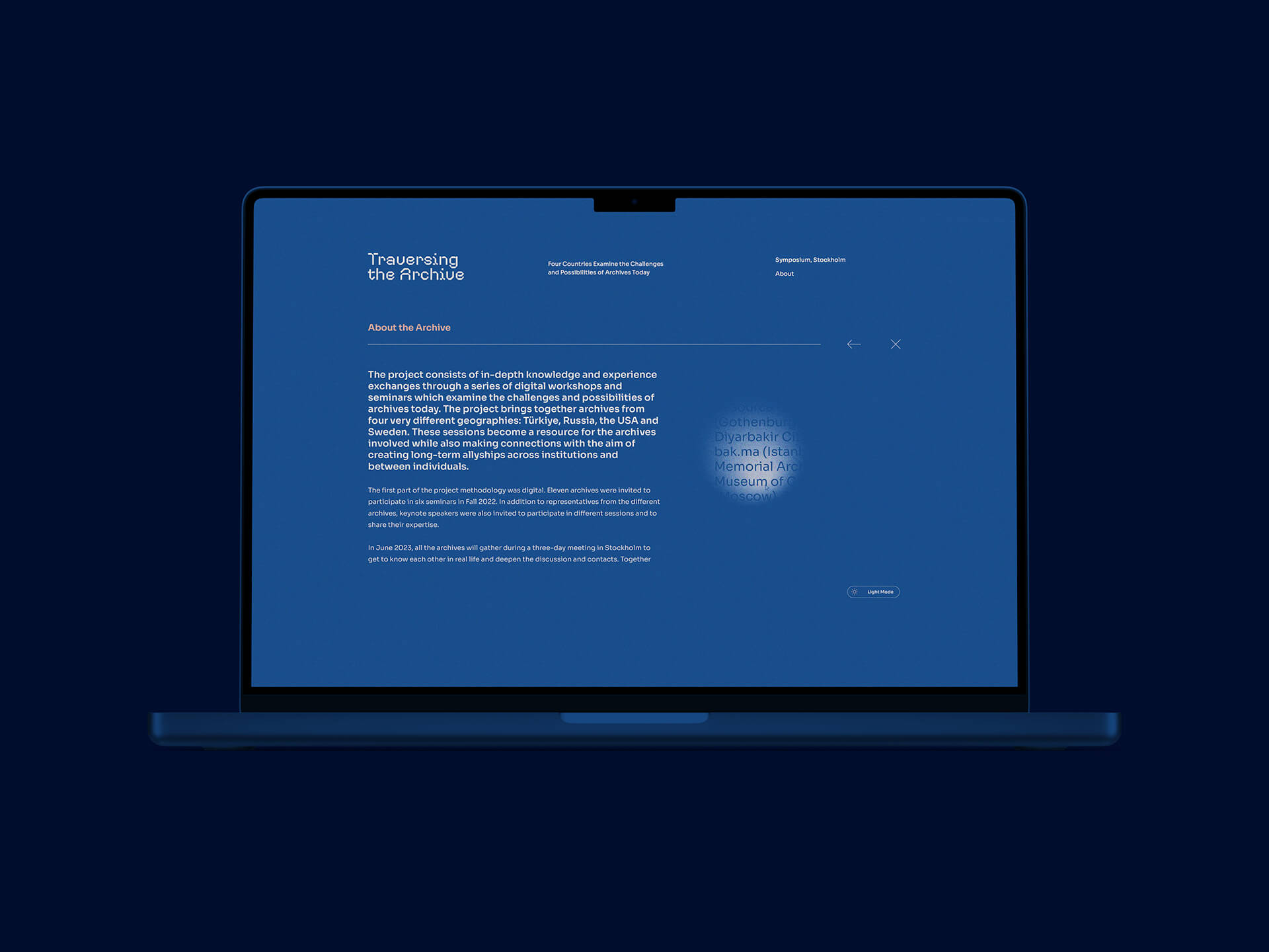
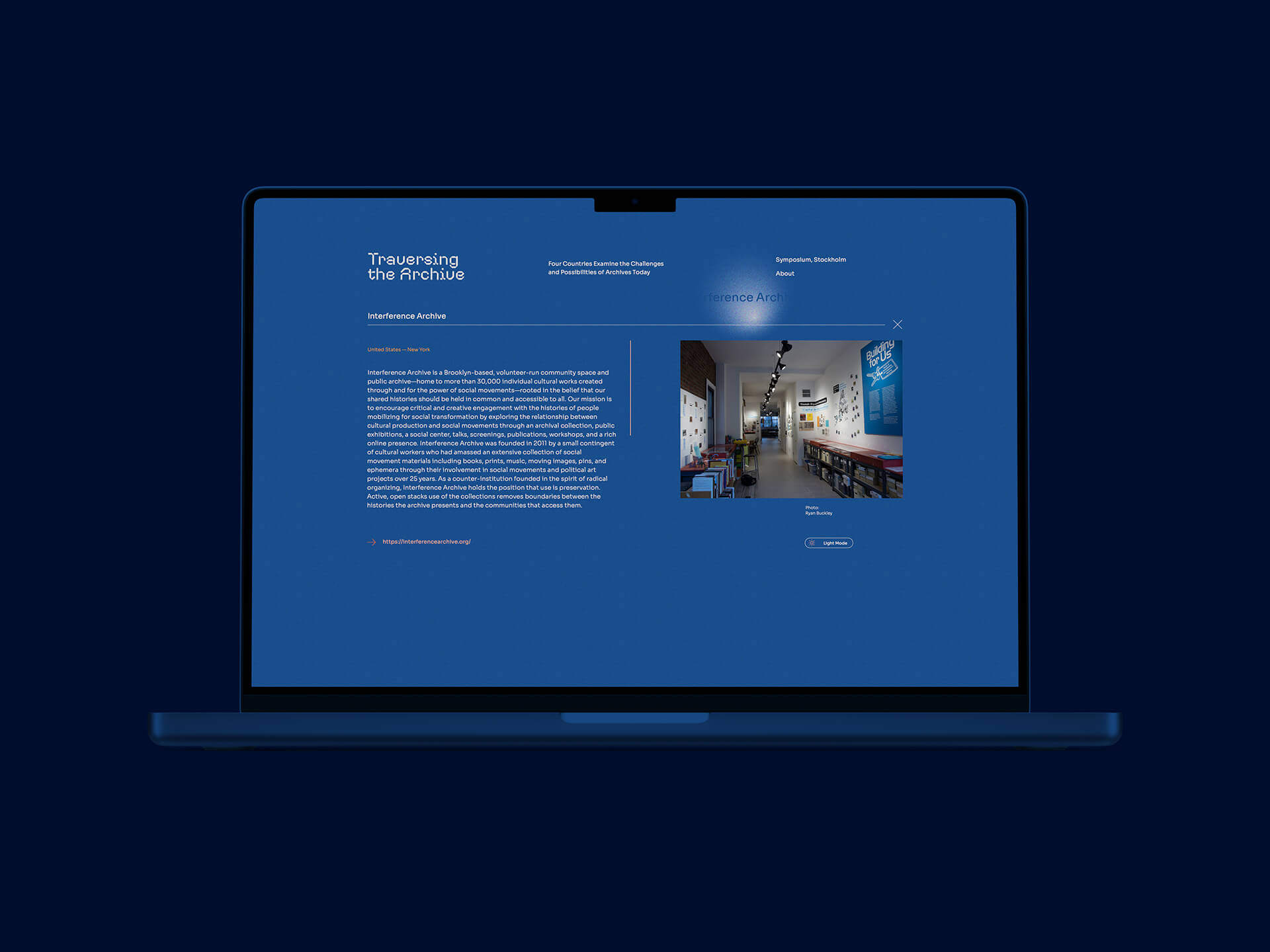
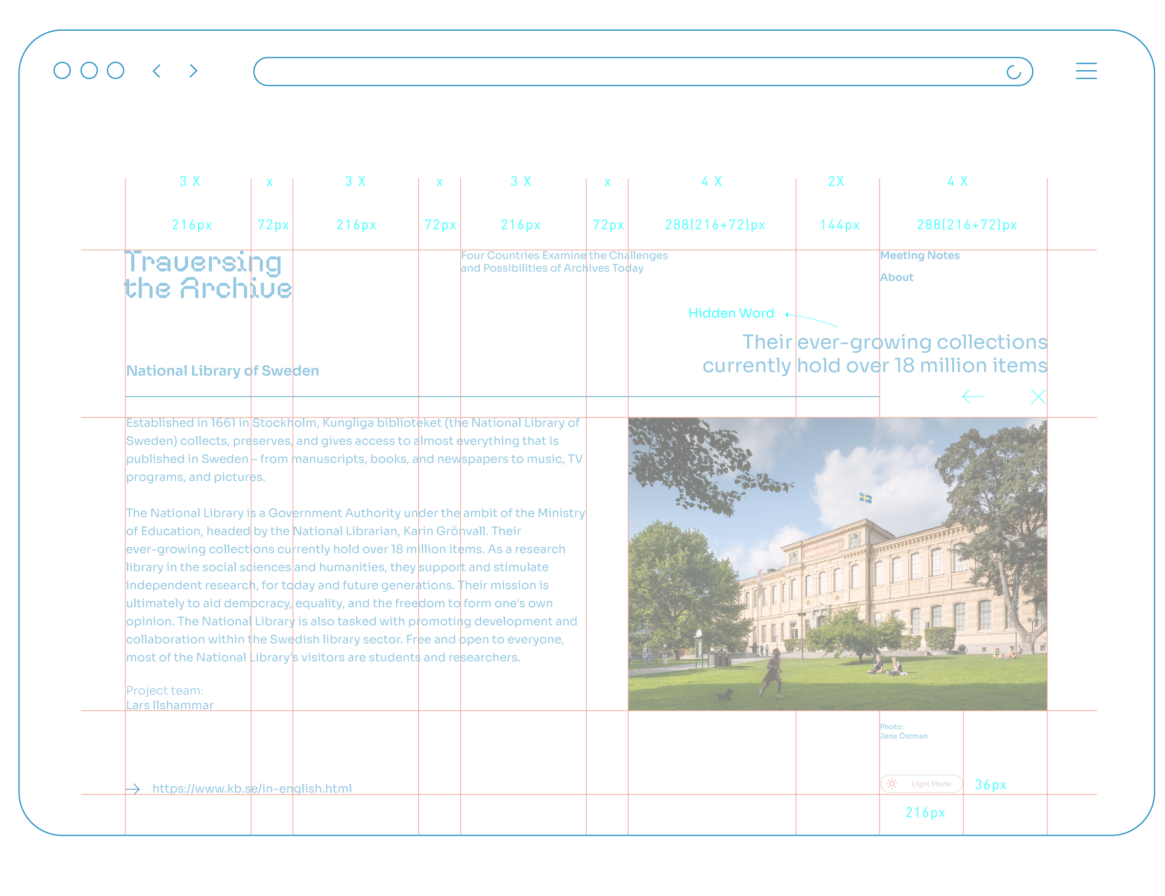
Furthermore, we introduced an additional layer of intrigue and discovery to the website by incorporating hidden text areas on various pages. These hidden text areas can only be revealed when users interact with specific elements, adding an element of surprise and engagement to the user experience.
All of these design elements were implemented in collaboration with Ciklet, the company responsible for the back-end development of the project. We worked closely with Ciklet to ensure that the grid system and hidden text areas were seamlessly integrated into the website, enhancing its overall functionality and interactivity.
THE CONCEPT
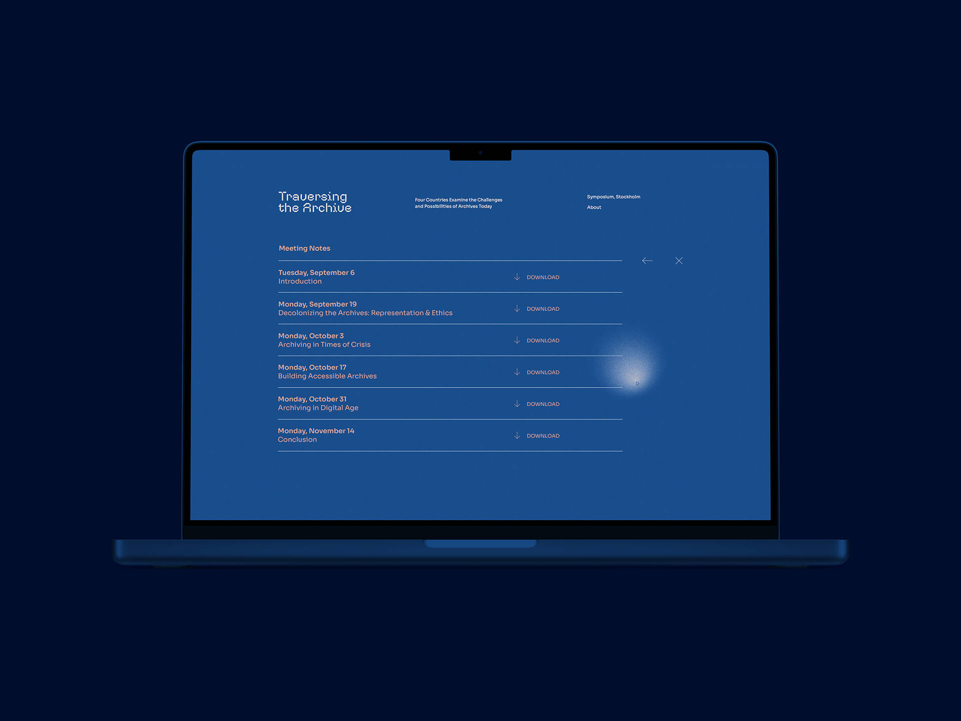
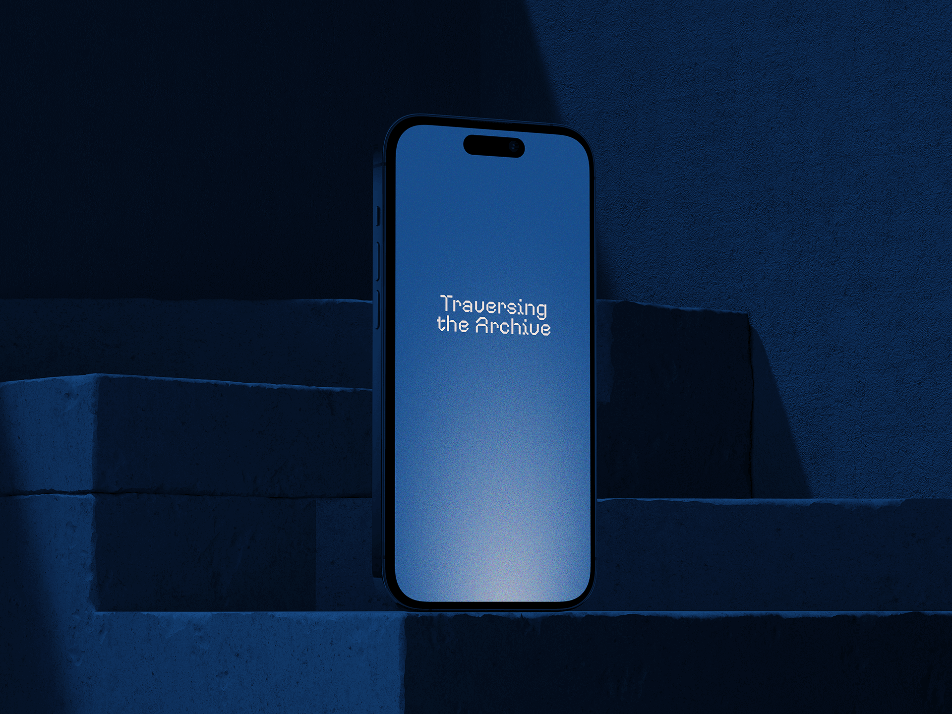
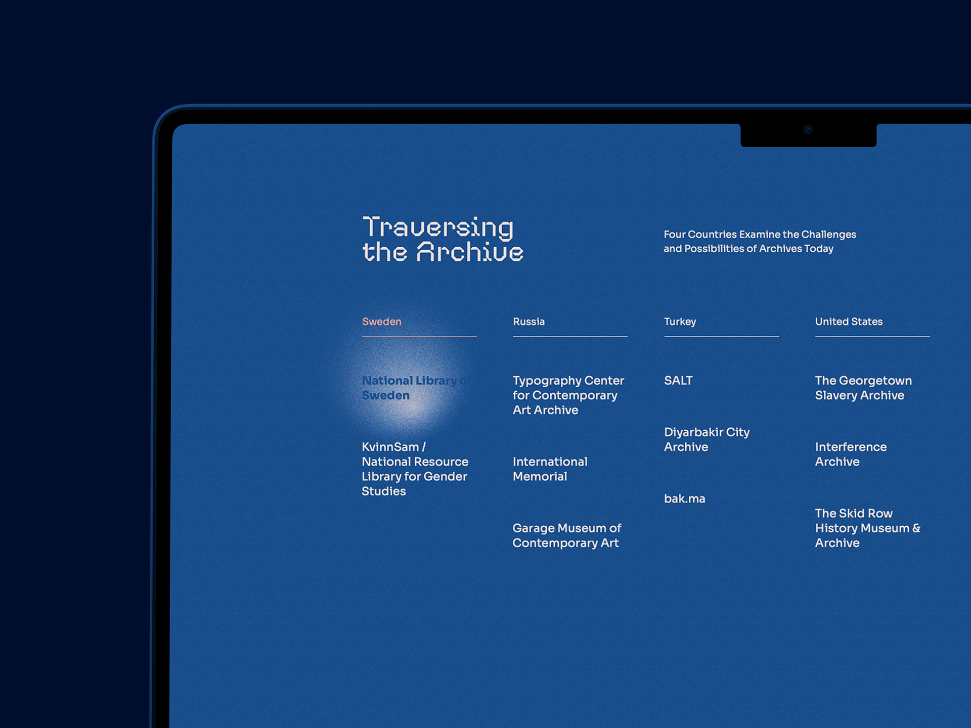
Traversing the Archive embodies the essence of exploration and discovery. The concept behind the design draws inspiration from the idea of searching for knowledge in the dark. To bring this concept to life, We designed a unique flashlight effect on the cursor. When you hover over an element, it emerges from the darkness, revealing its contents. Some pages even feature secret text areas that are only visible when accidentally hovered over, creating an element of surprise and intrigue for the users.

The concept behind the design draws inspiration from the idea of searching for knowledge in the dark. To bring this concept to life, we designed a unique flashlight effect on the cursor.
THE GRID SYSTEM
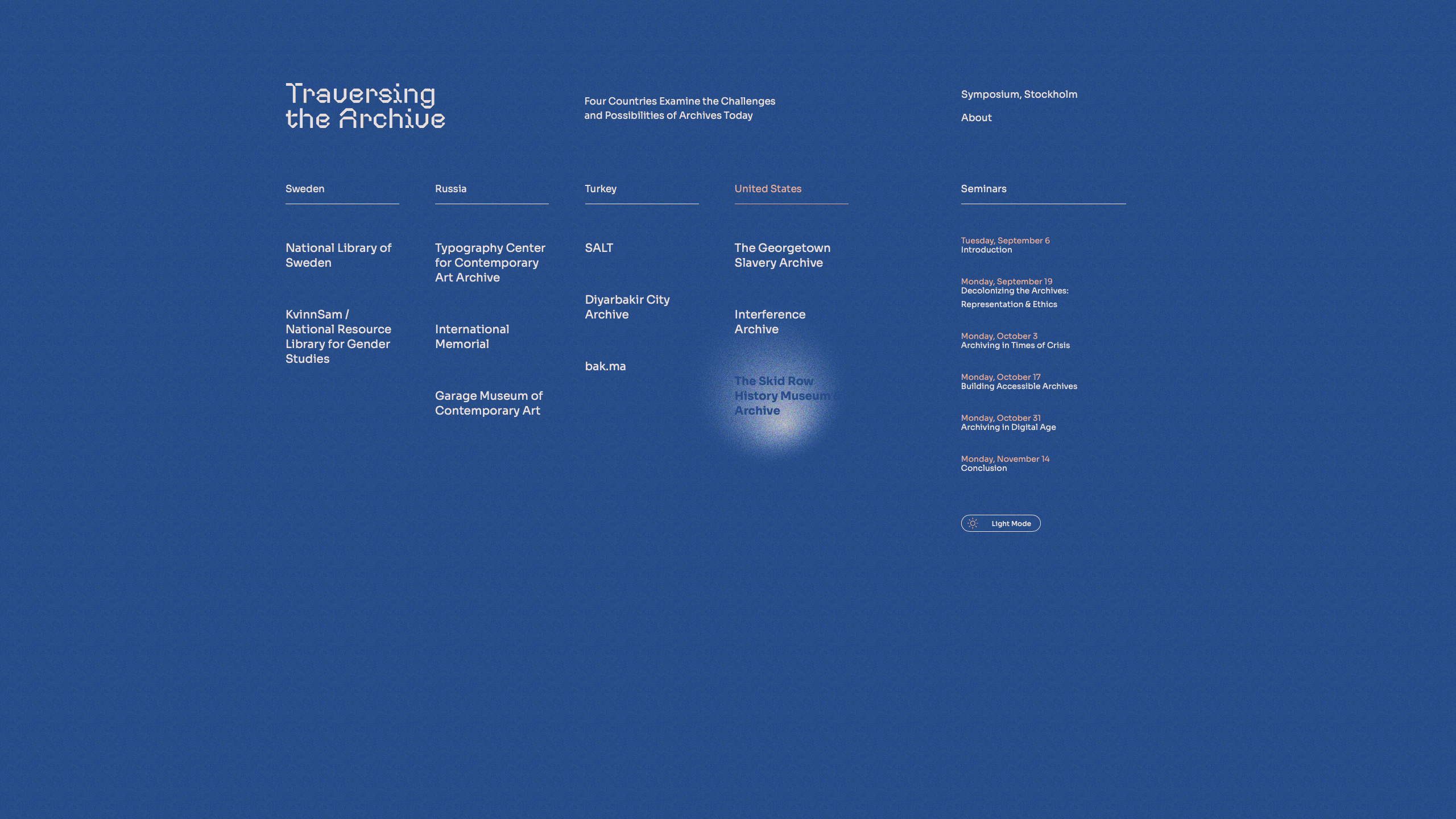
In the design of the website, we established a grid system, which served as the structural foundation for presenting all the information on the homepage. This grid system allowed us to organize and display content in a visually coherent and user-friendly manner.
The concept behind the design draws inspiration from the idea of searching for knowledge in the dark. To bring this concept to life, we designed a unique flashlight effect on the cursor.
