Rami Library Branding
Republic of Türkiye
Ministry of Culture and Tourism
Ministry of Culture and Tourism
Year /
November 2022
Project /
Rami Library Branding Design
Rami Kütüphanesi Kimlik Tasarımı
Rami Kütüphanesi Kimlik Tasarımı
Website /
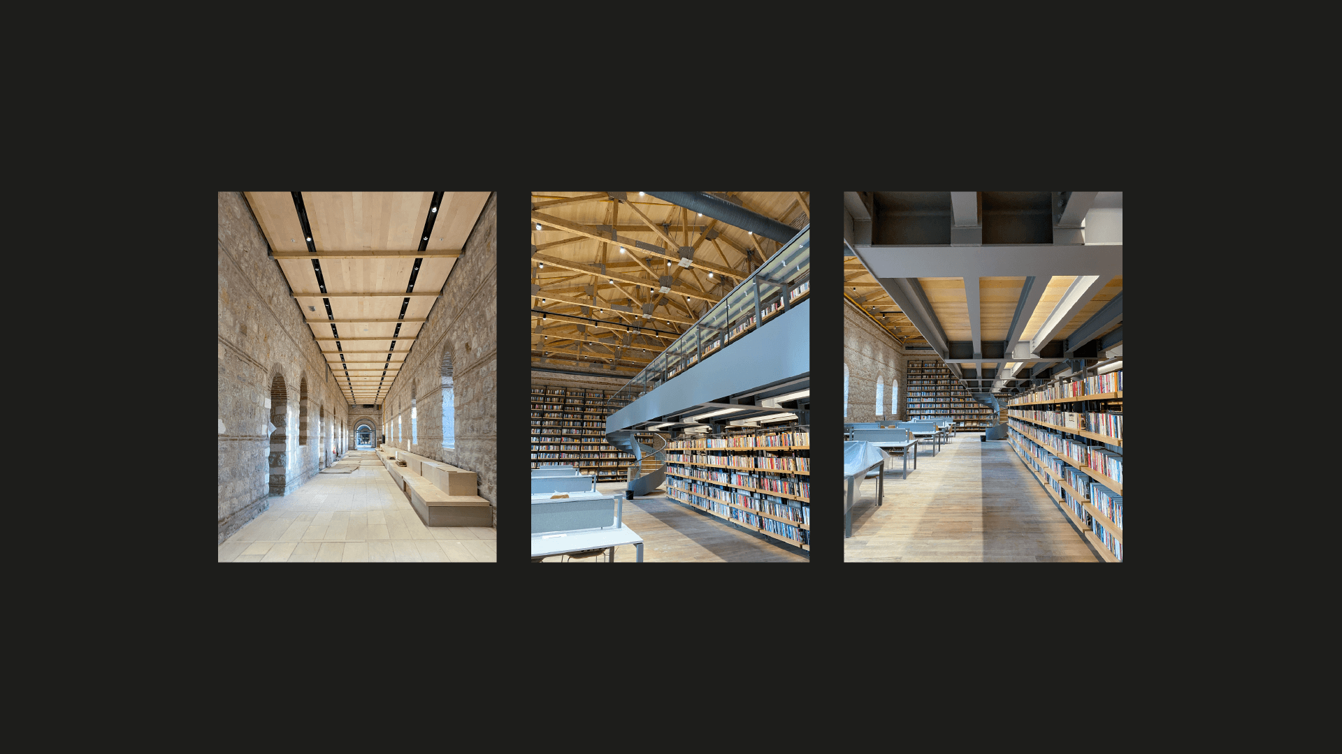
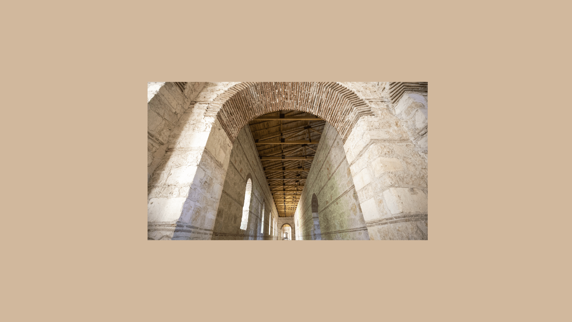
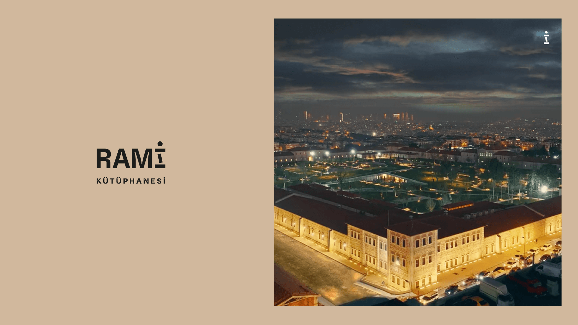
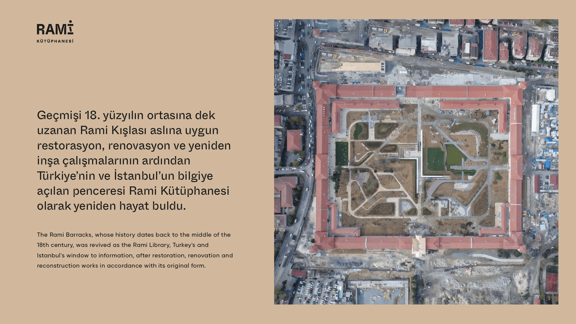
Rami Library — The historical Rami Barracks was re-functionalized as the Rami Library after the restoration, renovation, and reconstruction works carried out by the Republic of Türkiye Ministry of Culture and Tourism. Rami Library logo and other corporate identity elements, as well as the wayfinding system, are also designed by studio.ta.
Rami Library is a large campus with individual and group reading halls, activity areas, workshop spaces, a disabled center prepared for people with disabilities, and various possibilities of use such as conversations, seminars, and exhibitions.
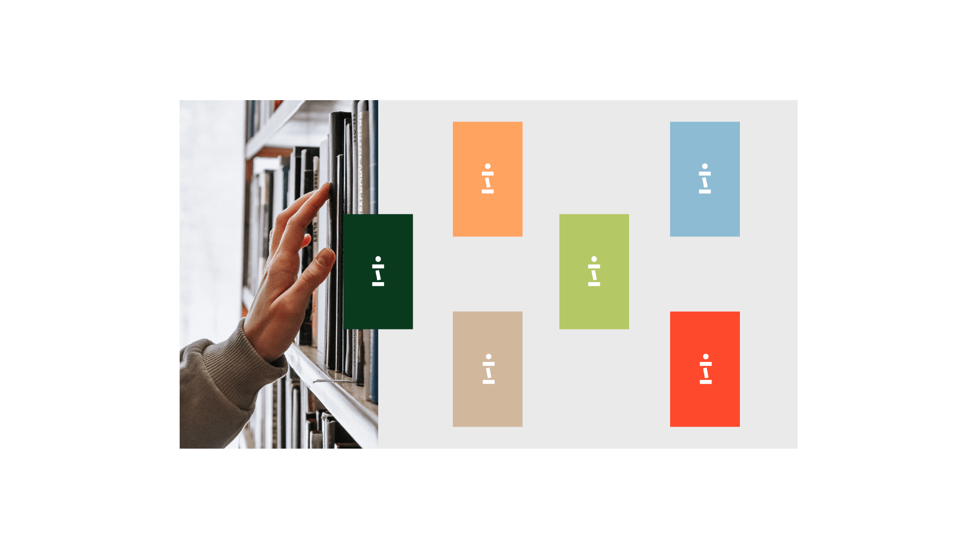
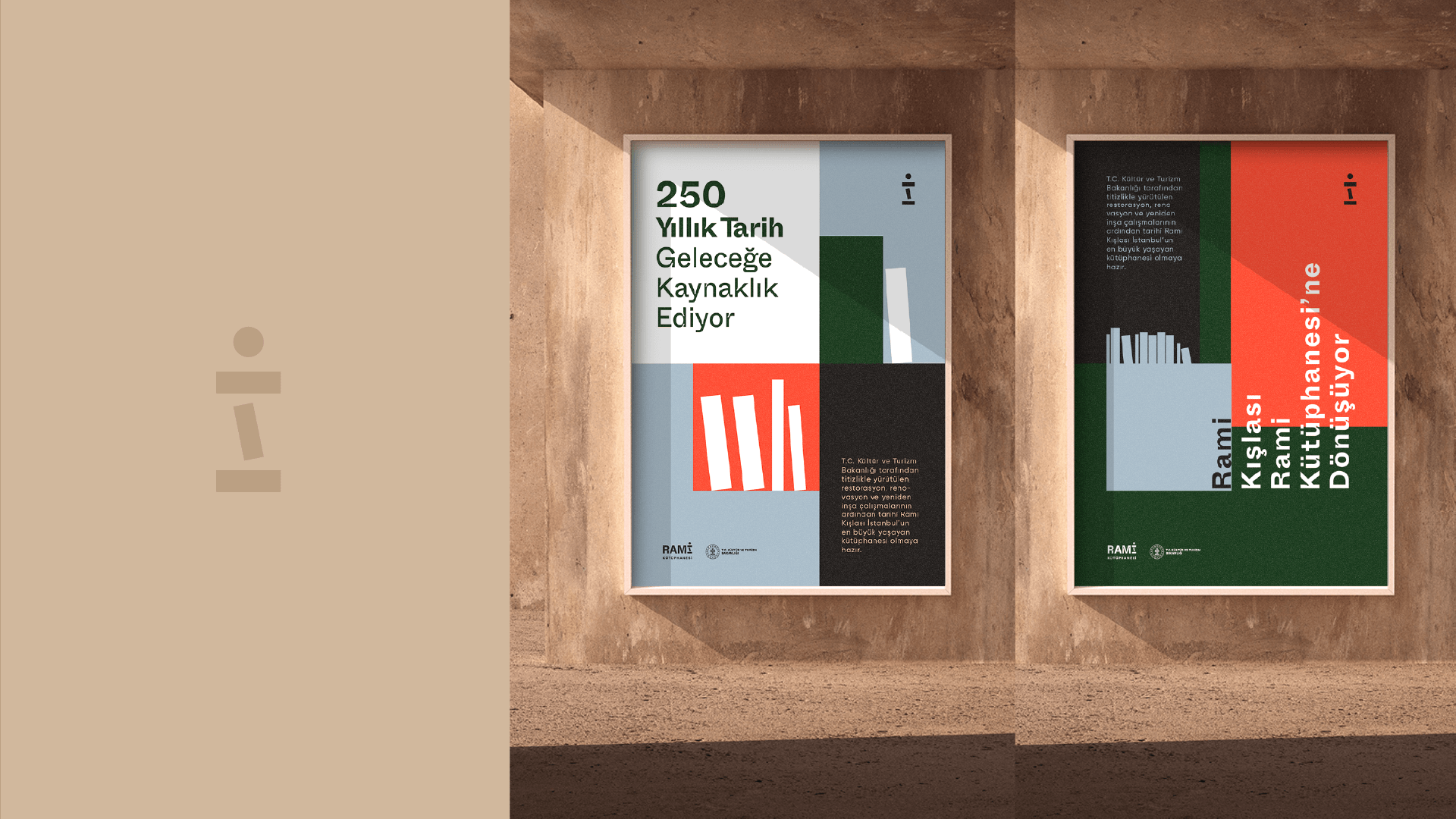
The new brand identity created by studio.ta aims to emphasize the value of the library where information is collected and shared. With the typeface chosen for the letters in the word RAMİ, the identity made a reference to the bookbinding and treated each letter as a physical object. By using the letter i as a logotype, it is aimed to underline the fact that the Rami Library is an “information point” and to emphasize the information and the physical area where the information is stored.
The beige shade chosen for the main color is based on the chromatic analysis of the Rami Barracks and represents the barracks structure. Other selected tones combined with a dynamic, energetic, classy, and lively design formed the basis of the brand personality.
→ rami kütüphanesi → rami library →
→ rami kütüphanesi → rami library →
→ rami kütüphanesi → rami library →
→ rami kütüphanesi → rami library →
→ rami kütüphanesi → rami library →
The Concept
Rami Library is a hub where knowledge is collected and shared. The logo aims to highlight the interaction it creates among people and information.
Rami Kütüphanesi, bilginin toplandığı ve paylaşıldığı bir merkezdir. Logo, insanlar ve bilgiler arasında yarattığı etkileşimi ön plana çıkarmayı amaçlamaktadır.
by using the letter ” i ” as a logotype, it is aimed to underline the fact that the Rami Library is an “information point” and to emphasize the information and the physical area where the knowledge is stored.